5 Web Design Trends How To Build A Mobile-Friendly Website With Web Design Services
Have you ever wondered what it takes to build a mobile-friendly website that not only looks great but also functions seamlessly on any device? The digital landscape is constantly evolving, and as experts in digital marketing, we understand the importance of staying ahead of the curve. In this article, we’ll dive into the latest web design trends and provide you with a step-by-step guide on how to build a mobile-friendly website with web design services.
Understanding the Importance of Mobile-Friendly Design
In today’s fast-paced world, people use their smartphones for almost everything—from shopping online and reading the news to communicating with friends and browsing social media. This shift in user behavior means that having a mobile-friendly website is no longer optional; it’s a necessity. If your site isn’t optimized for mobile, you could be missing out on a significant portion of your audience.
The Impact of Mobile Usage on User Experience
When users visit a non-mobile-friendly site, they often encounter issues such as slow load times, difficult navigation, and unreadable text. These frustrations can lead to higher bounce rates and lower conversion rates. Ensuring that your website is mobile-friendly can result in a better user experience, increased engagement, and higher customer satisfaction.
SEO Benefits of a Mobile-Friendly Website
Search engines, particularly Google, prioritize mobile-friendly websites in their rankings. This means that if your site isn’t optimized for mobile, it’s likely to fall behind in search engine results pages (SERPs). A mobile-friendly design can improve your site’s SEO, making it more likely for users to find you when they search for relevant keywords.
5 Web Design Trends You Need to Know
To create a mobile-friendly website, it’s essential to stay updated on the latest web design trends. These trends not only enhance the visual appeal of your site but also improve functionality and user experience. Here are five key trends to consider:
1. Responsive Design
Responsive design ensures that your website adapts to various screen sizes and orientations, providing a consistent user experience across devices. This design approach uses flexible grids, images, and CSS media queries to adjust the layout automatically.
Why Responsive Design Matters?
A responsive design eliminates the need for multiple versions of your website, saving time and resources. It also ensures that users have a seamless experience, whether they’re on a desktop, tablet, or smartphone.
2. Minimalism and White Space
Minimalism focuses on simplicity and clarity, reducing clutter and emphasizing essential elements. This trend often incorporates ample white space, allowing content to breathe and making it easier for users to focus on key information.
Benefits of Minimalism
A minimalist design can enhance user experience by making navigation intuitive and content easily digestible. It also helps to speed up load times, which is crucial for mobile users.
3. Micro-Animations
Micro-animations are subtle, short animations that guide users and provide feedback on their actions. These animations can make interactions more engaging and intuitive, enhancing the overall user experience.
How to Use Micro-Animations Effectively
Use micro-animations to highlight important elements, such as buttons or links, and provide visual feedback for actions like form submissions. Be careful not to overuse them, as too many animations can be distracting.
4. Bold Typography
Bold and creative typography can make your website stand out and communicate your brand’s personality. This trend involves using large, eye-catching fonts to draw attention to key messages and content.
Tips for Using Bold Typography
Choose fonts that are legible on all devices and ensure there’s enough contrast between text and background. Use bold typography sparingly to emphasize important information without overwhelming the user.
5. Dark Mode
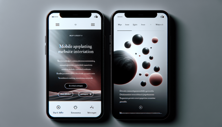
Dark mode offers an alternative color scheme that uses dark backgrounds and light text. This trend has gained popularity due to its modern aesthetic and potential benefits for reducing eye strain.
Implementing Dark Mode
Consider providing users with an option to switch between light and dark modes. Ensure that your dark mode design maintains readability and visual appeal without sacrificing usability.
How to Build a Mobile-Friendly Website with Web Design Services
Building a mobile-friendly website can be a complex process, but with the right web design services, you can achieve a professional and effective result. Here’s a step-by-step guide to help you get started:
Step 1: Define Your Goals and Audience
Before diving into the design process, it’s crucial to understand your goals and target audience. What do you want to achieve with your website, and who are your primary users? This information will guide your design decisions and ensure that your site meets user needs.
Step 2: Choose the Right Platform
Selecting the right platform for your website is essential for achieving a mobile-friendly design. Content Management Systems (CMS) like WordPress, Shopify, and Wix offer responsive templates and customization options.
| Platform | Description | Pros | Cons |
|---|---|---|---|
| WordPress | Popular CMS with a wide range of themes and plugins. | Highly customizable, large community support. | Steeper learning curve, requires more maintenance. |
| Shopify | E-commerce platform designed for online stores. | Easy to use, excellent customer support. | Limited customization compared to WordPress. |
| Wix | User-friendly website builder with drag-and-drop functionality. | Simple setup, good for beginners. | Less flexible, limited scalability. |
Step 3: Design for Mobile First
Designing for mobile first means starting with the mobile version of your website and then scaling up for larger screens. This approach ensures that your site is optimized for the most common device types first.
Mobile-First Design Principles
- Prioritize essential content and features.
- Use a single-column layout to make navigation easier.
- Ensure buttons and touch targets are large enough for fingertip interaction.
- Opt for a simple, clean design to enhance readability.
Step 4: Optimize Images and Media
High-quality images and media can significantly impact your site’s performance, especially on mobile devices. Optimize images by compressing them without compromising quality and use modern formats like WebP.
Best Practices for Media Optimization
- Use responsive images that adjust based on screen size.
- Implement lazy loading to delay the loading of off-screen images.
- Consider using SVGs for icons and graphics as they are scalable and lightweight.
Step 5: Test and Iterate
Testing is a critical part of the design process. Use tools like Google’s Mobile-Friendly Test to evaluate your site’s performance on mobile devices. Gather feedback from users and make necessary adjustments to improve the experience.
Tools for Testing and Optimization
- Google Mobile-Friendly Test: Analyzes your website’s mobile usability.
- BrowserStack: Allows testing across multiple devices and browsers.
- PageSpeed Insights: Provides insights into page load times and performance optimization tips.
Enhancing User Experience with Advanced Features
Once you’ve built a mobile-friendly website, consider adding advanced features to further enhance user experience.
Progressive Web Apps (PWAs)
PWAs combine the best of web and mobile applications, offering features like offline access, push notifications, and fast load times. They provide a native app-like experience without requiring users to download an app.
Accelerated Mobile Pages (AMP)
AMP is a framework developed by Google to improve page load times on mobile devices. By using a simplified HTML and restrictive set of JavaScript, AMP pages are lightweight and load almost instantly.
Voice Search Optimization
With the increasing popularity of voice assistants like Siri and Alexa, optimizing your website for voice search can give you a competitive edge. Focus on natural language keywords and ensure your content directly answers user queries.
The Role of Web Design Services in Building Mobile-Friendly Websites
Working with professional web design services can streamline the process of creating a mobile-friendly website. Here’s how these services can benefit you:
Expertise and Experience
Web design agencies have the expertise and experience needed to create visually appealing and functional websites. They stay updated on the latest trends and best practices, ensuring that your site remains competitive.
Customization and Flexibility
Professional web designers can tailor your website to suit your brand and user needs. They can create custom features and functionalities that enhance user experience and set your site apart from competitors.
Ongoing Support and Maintenance
A reputable web design service will provide ongoing support and maintenance to keep your website running smoothly. This includes regular updates, security checks, and performance optimizations.
Final Thoughts
Building a mobile-friendly website is essential in today’s digital age. By staying informed about the latest web design trends and working with professional web design services, you can create a site that not only looks great but also delivers a seamless user experience. Remember to define your goals, choose the right platform, design for mobile first, optimize your media, and continuously test and iterate.
With these strategies in place, you’ll be well on your way to creating a mobile-friendly website that attracts and retains users, improves your SEO, and supports your digital marketing efforts. So, are you ready to take your website to the next level? Let’s get started on building a mobile-friendly site that stands out in the ever-evolving digital landscape.